Wait Design: Optimizing the waiting experience at McDonald's
Leveraging UX methods and cognitive science to transform waiting into a pleasant and engaging experience.
Skills
UX/UI Design, Mobile app
Sector
Food
Date
June 2024
Introduction
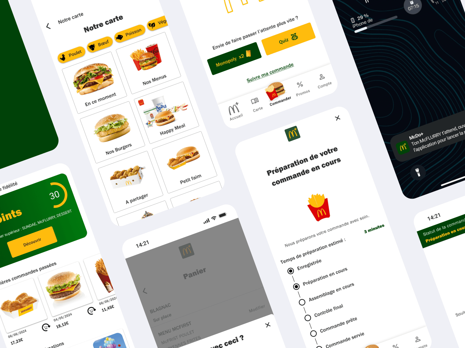
This project is part of a "Wait Design" workshop aimed at improving the customer experience at McDonald's. It focused on optimizing the perception of waiting time. By combining market analysis, UX design, and continuous evaluation, we developed a comprehensive approach to improve the customer journey. Our goal was to propose innovative solutions tailored to consumer expectations.
Initial analysis
Market study
The fast-food market in France is experiencing sustained growth with McDonald's as the leader, despite increasing competition. Consumer preferences are evolving, favoring product diversification and an increased demand for quality food and sustainable practices. Challenges such as rising costs and recruitment difficulties are forcing key players to innovate.
The importance of digitalization is confirmed with the rise of online ordering and mobile applications. In this context, innovation, customer loyalty, and improving the customer experience have become essential to attract and retain consumers, thus ensuring the competitiveness and long-term viability of the brands.
Competitive benchmark
This market study led us to examine McDonald's direct (Burger King, KFC, Five Guys) and indirect (Starbucks, Subway, Pizza Hut) competition in more detail. A comparative analysis of interfaces, products, and strategic positioning allowed us to identify McDonald's strengths and weaknesses, as well as opportunities for improvement.
McDonald's brand analysis
McDonald's positions itself as the global leader in fast food, offering a standardized and accessible experience for everyone, with a focus on speed, convenience, and product consistency. The brand targets a wide range of consumers, including families, young adults, students, and professionals looking for quick and affordable meals.
The brand's success is due to a series of strategic factors. First, innovation and adaptability play a key role. The company knows how to adapt to local tastes and trends by introducing market-specific products, such as the McBaguette in France, and by diversifying its offerings with vegetarian options and healthier products. This ability to respond to local preferences and evolving eating habits allows McDonald's to remain relevant to a diverse customer.

User research
Panel definition
To understand customer needs, behaviors, motivations, and attitudes, we used methods for collecting and analyzing qualitative and quantitative data.
After an in-depth analysis of the market and McDonald's strategic positioning, we selected a target population for our study. Our panel was intentionally very broad.
Men and women aged 15 to 80, from all social backgrounds (students, professionals, retirees, etc.).
Data collection methods
To gain a deep understanding of McDonald's customers' needs and frustrations regarding waiting, we conducted in-depth user research using various methods.
Qualitative interviews
Objective: To explore customer behaviors, motivations, frustrations, and expectations regarding their McDonald's experience, particularly waiting.
Participants: A diverse sample of 15 McDonald's customers, representative of the target audience (age, consumption habits, visit frequency, etc.), was recruited.
Process: We conducted 10-minute semi-structured interviews based on a flexible interview guide that allowed us to delve into important points. The interviews were transcribed for analysis.
Topics covered:
- Consumption habits (frequency, time of day, type of order, etc.),
- In-restaurant experience (overall satisfaction, positive and negative points),
- Perception of waiting (nature of frustration, impact on the overall experience),
- Use of digital tools (mobile app, website, ordering kiosks),
- Suggestions for improvement.

Questionnaire
Objective: To gather quantitative data from a larger sample to validate and complement the insights from the qualitative interviews.
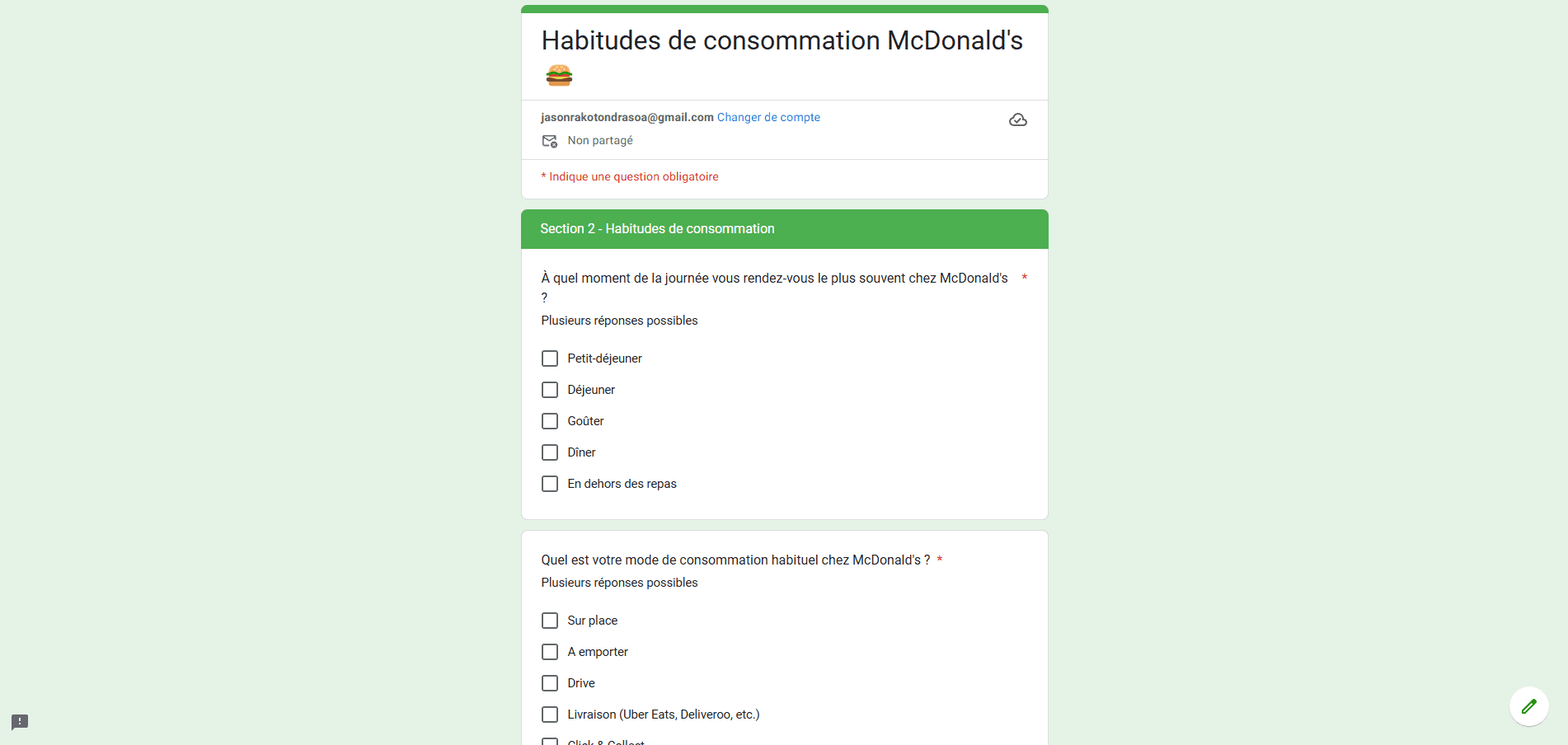
Participants: The questionnaire was distributed online via the general Teams channel of the ESD Toulouse campus, as well as an Instagram story with a clickable link to the online form. The anonymous nature of the questionnaire encouraged participation and sincerity of responses.
Content: The questionnaire included closed-ended questions (multiple choice, rating scales) to measure satisfaction, visit frequency, preferences, etc., as well as open-ended questions to gather comments and suggestions.
Topics covered:
- Visit frequency, consumption times,
- Preferred ordering methods (on-site, take-out, drive-thru, click & collect),
- Use of digital tools,
- Overall satisfaction,
- Points of frustration related to waiting,
- Expectations and suggestions for improvement.
Field observation
Objective: To observe real customer behaviors in different McDonald's restaurants to identify friction points and the most problematic waiting times.
Process: Non-participant observations were conducted during peak hours (lunch, dinner) in two McDonald's restaurants with different profiles (urban and suburban). The observations were documented with notes and photos.
Points observed:
- Customer flow,
- Customer profiles,
- Waiting times at different touchpoints (ordering kiosks, counter, drive-thru),
- Customer behaviors during waiting,
- Interactions with staff,
- General restaurant atmosphere.

Data analysis
The data collected from interviews, questionnaires, and observations were analyzed jointly to identify trends, convergences, and divergences. This analysis provided key insights into customer frustrations and expectations regarding waiting at McDonald's.

By combining these user research methods, we were able to gain a deep and holistic understanding of McDonald's customer expectations.
Speed of service, competitiveness, and the taste quality of products emerged as the main priorities for consumers.
These insights were then used to create representative personas and a user experience mapping, which served as the basis for the UX design phase.
Persona
The data we collected allowed us to define 4 typical profiles: the connected student, the caring grandfather, the busy mom, and the digital nomad.
Here are the details of the connected student persona.

UX Mapping

Identified friction points
The main difficulties encountered by users are at three levels:
- Complex and slow interfaces: Navigation difficulties and technical slowness on the kiosk, website, and app.
- Waiting time: Excessive waiting time when ordering and picking up products, causing frustration.
- Lack of information: Absence of clear information on waiting times.
Opportunities
To remedy these problems, several areas for improvement can be considered:
- Simplify and optimize interfaces: Intuitive navigation, reduced ordering steps, pre-configured menus, and personalized offers.
- Reduce waiting times: Optimization of ordering and preparation processes, better management of queues.
- Improve communication: Clear information on waiting times, entertainment or useful information on kiosks, and notifications on order progress.
Our mobile interface improvement proposals
For the project, we focused on the mobile application, bringing several improvements.
Availability of free seating in the restaurant
History of recent orders
Improvement of the ordering process
Integration of temporary mini-games
Real-time order tracking
UX Design
Interface audit (website, mobile app, and ordering kiosk)
The main objective of the UX audit of McDonald's interfaces is to evaluate the usability and effectiveness of the company's various digital platforms, including the website, mobile app, and in-restaurant ordering kiosks. We aim to identify the friction points that users may encounter when interacting with these interfaces, in order to propose solutions to eliminate them and improve the overall user experience.
We conducted a complete audit of McDonald's digital interfaces based on Jakob Nielsen's 10 heuristic principles and Bastien and Scapin's ergonomic principles. These references allowed us to evaluate the conviviality, effectiveness, and user satisfaction during their interaction with the different interfaces. By using these principles, we identified the strengths and weaknesses of McDonald's various digital channels.

The analysis of McDonald's interfaces reveals a polished design, but there are areas for improvement to enhance accessibility and optimal regulatory compliance. The "accessible" mode on the kiosks, which is currently identical to the "child" mode, should be redesigned to meet the specific needs of users with disabilities. The length of the ordering tunnel and the obligation to create an account on the app are also barriers to the user experience and deserve to be optimized.
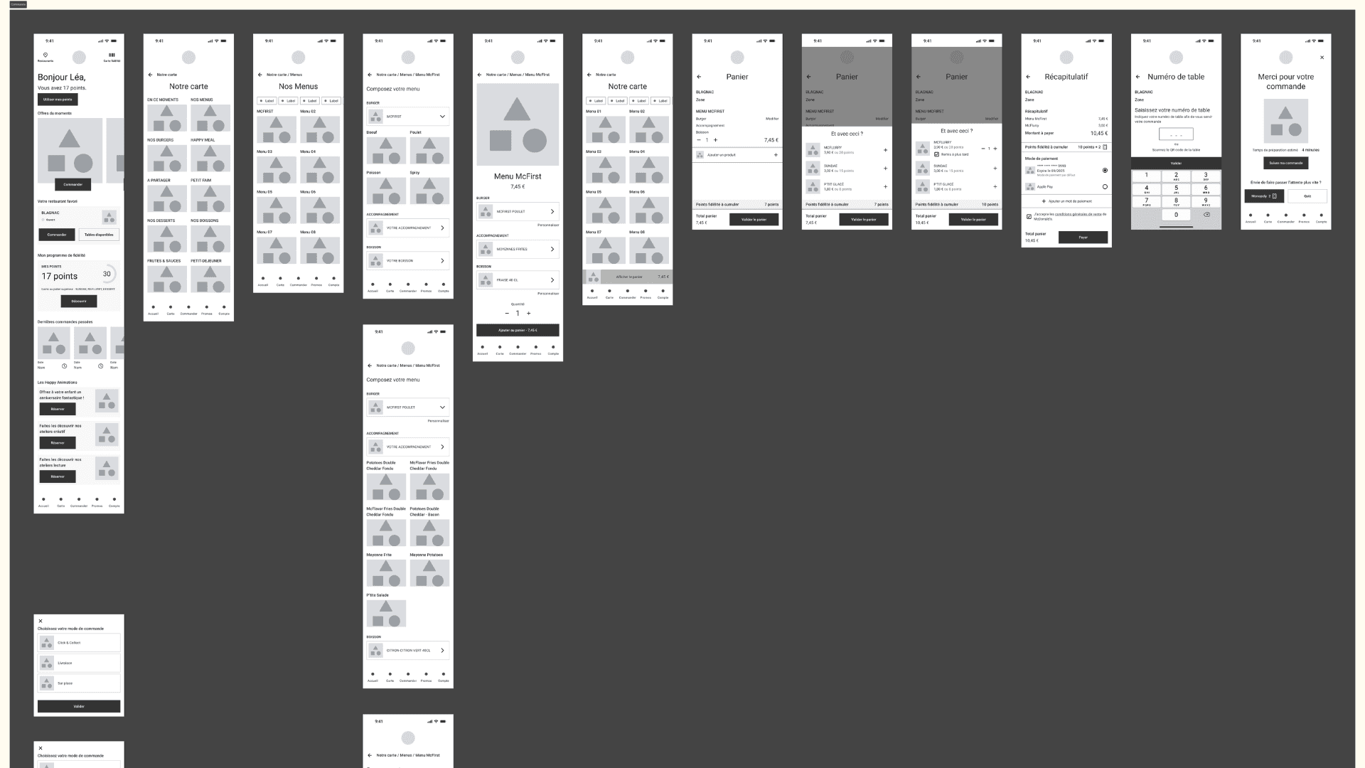
Wireframes
Focus on the mobile app.
Mockups
Focus on the mobile app.
Design and usability
The current state
The app's main objective, which is to order, is not highlighted with the "order" button in the navigation bar. Furthermore, products are not highlighted, and given the large number of choices, this can give the user the impression of an endless scroll.
Proposals
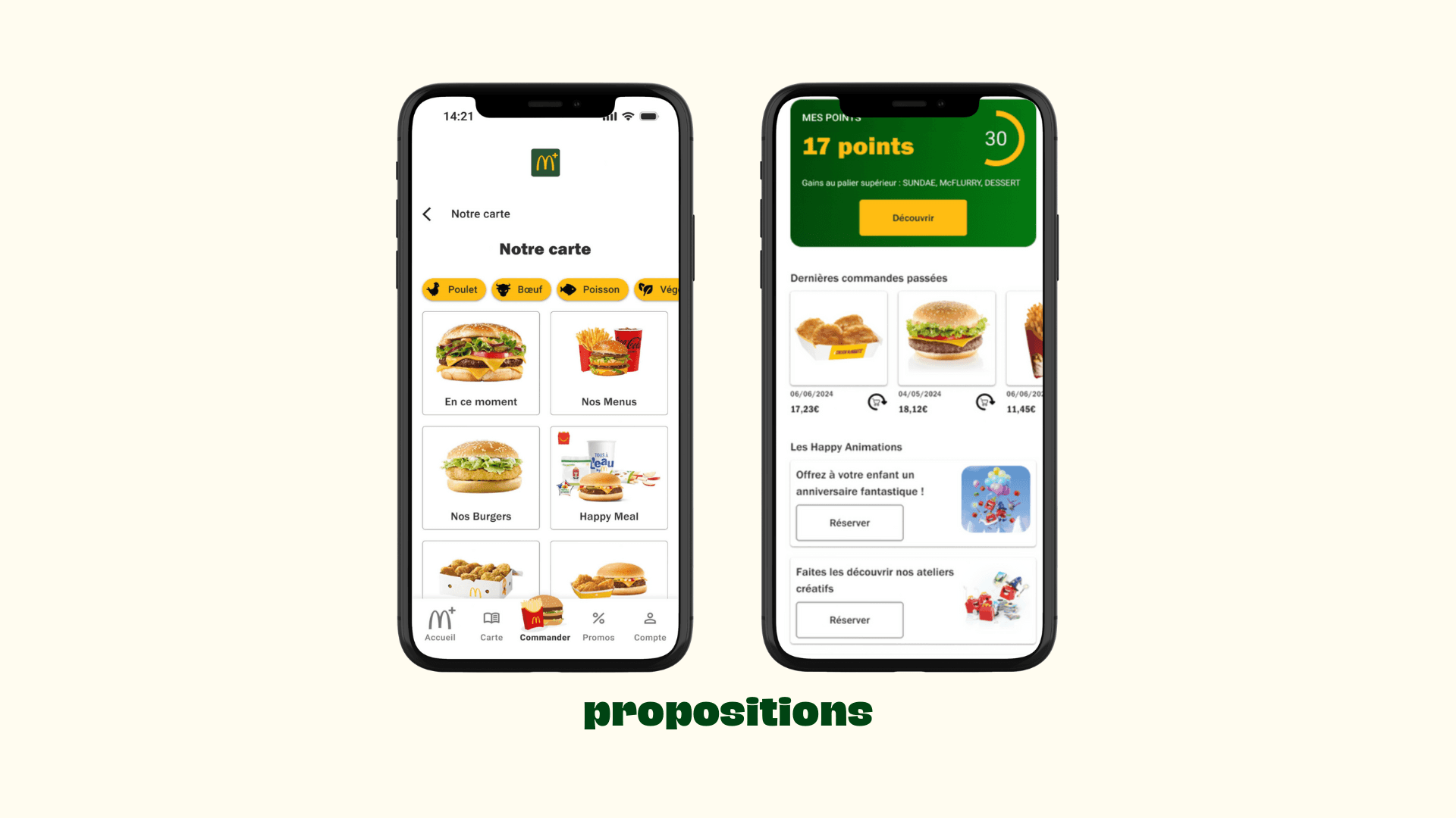
New "order" button: The ordering action is highlighted with an attractive and quickly identifiable visual.
Redesigned ordering flow: The product menu is arranged in "cards," which highlights the food while giving the user a global view. In addition, menu customization is handled in steps, allowing the user to limit the visual content load.

Clarity of information and sources
The current state
Although present in the app, the loyalty program and its benefits may not be explicit. This could lead to a lack of user interest and engagement in the loyalty program.
Proposals
Highlight the loyalty program: This allows users to easily see their earnings and the program's benefits.
Reminder of loyalty points in the cart: This makes it easy to track accumulated points and encourages users to use the loyalty program.
Product recommendation + "save for later" function: This offers a personalized suggestion and increases the average cart value while improving the experience.
Push notifications: This gives the user real-time feedback, limiting the frustration of uncertainty about their order's progress.

Usage
The current state
After placing an order, customers have no visibility into its preparation status. This uncertainty can cause anxiety, especially during peak hours when the wait can be longer.
Currently, if a customer wants to order a dessert for later, they have to go to the counter to inform staff. This leads to an additional wait.
Proposals
Real-time order tracking: This reduces the uncertainty and anxiety associated with waiting by providing real-time information on the order's progress.
Mini-games: This improves the waiting experience by offering a fun distraction while strengthening customer engagement.
Ability to start the dessert preparation: This gives the user more control over their order.

Navigation
The current state
The McDonald's menu is vast and varied. For a user in a hurry or who is undecided, scrolling through the entire menu can be tedious and time-consuming.
Regular customers often have well-defined ordering habits, whether it's a specific menu or a custom combination of products. Recreating these orders every time can be a waste of time and energy.
Proposals
Filters in the product menu: Filters allow the user to quickly navigate by refining their search based on their preferences.
Recent order history: This allows the user to quickly find previous orders and reorder them in a few clicks, without having to browse the entire menu again.
User testing
User test plan for the mobile app
We implemented moderated in-person tests. A moderator was present to guide participants through a specific user scenario and observe interactions. The moderator could ask clarifying questions and adapt the test based on participants' reactions.
The objective was to evaluate the usability, ease of use, and relevance of the mobile app's new features and to identify areas for improvement.
Number of participants: 5
Age and gender: Undefined
Test duration: 15 minutes (including discussion)
Materials: A smartphone with the prototype and an observation grid
A/B testing - real-time order tracking
Version A: discreet and retractable widget
In this version, a small widget is positioned in the upper right corner of the screen. It is present on all app screens when an order is in progress. It displays the estimated preparation time for the order.
Version B: interactive banner
In this version, a banner occupies the top of the screen, legibly displaying the order status and estimated preparation time. It is present on all app screens when an order is in progress.

A/B testing results
Version A: discreet and retractable widget
Pros 🟢
- Discretion: The widget occupies only a small space at the top right of the screen, leaving more room for other content.
- Minimalist: The simple and clean presentation of the widget may be appreciated by users who prefer a minimalist interface.
Cons 🔴
- Lack of interactivity: No visual element indicates that the widget is clickable, which may prevent users from accessing more detailed information.
- Limited information: The widget only displays the estimated time and three basic tracking steps, which may be insufficient for some users.
Version B: interactive banner
Pros 🟢
- Increased visibility: The banner attracts more user attention due to its position at the top of the screen and its larger size.
- Clear and detailed information: The banner displays the order status and estimated time in a clearer and more concise way and can include a visual progress bar.
- Interactivity: The presence of an arrow or another visual element clearly indicates that the banner is clickable, allowing access to more details.
Cons 🔴
- Potentially intrusive: Some users might find the banner too large or distracting.
- Adaptation required: The banner's integration may require interface adjustments to ensure an optimal user experience.
Summary of interviews conducted
User feedback highlighted significant differences between the two versions:
- Visibility: Version B (banner) was considered more visible and clearer than Version A (widget). Users noticed the banner more easily and found the information more accessible.
- Interactivity: The presence of an interactive arrow on the Version B banner prompted users to click for more details about their order. In contrast, the Version A widget was not perceived as interactive by some users.
- Level of information: Users appreciated the more detailed presentation of order tracking in Version B, with the order status and estimated time clearly displayed. Some Version A users found the information insufficient and wanted more details on their order's progress.
- Overall satisfaction: Version B was generally better received by users, who found the order tracking more intuitive, informative, and reassuring.
"I found the informational banner very useful for tracking the progress of my order. It was clear and I knew exactly where my delivery was." Carla, 19-year-old student.
"The widget didn't bother me, but I didn't realize it was clickable. However, I'd like to see more information from the start, like the detailed status of my order." Thomas, 35-year-old professional.
The A/B test results clearly show that Version B of the real-time order tracking is more effective than Version A. The informational banner, being more visible, interactive, and detailed, better meets user expectations and improves their overall experience with the app.
Test feedback

Conclusion
A thorough UX methodology-based analysis of McDonald's digital and physical interfaces revealed significant opportunities for improvement to enhance the customer experience and maintain its leadership position in the French fast-food market.
By optimizing the mobile app to reduce perceived waiting time, offer a fluid and accessible purchasing experience, and introduce features like guest checkout and real-time order tracking, McDonald's can not only meet growing consumer expectations but also differentiate itself from its competitors.
Thanks to a user-centric approach, McDonald's strengthens its ability to build customer loyalty, attract new customers, and maintain its leading position by offering innovative experiences tailored to current needs.
Thus, investing in UX optimization represents not only strategic added value for McDonald's but also a guarantee of sustainability and growth in a competitive and constantly evolving market.
Project completed with: Anna LUBAT & Isabelle EUGÈNE

